
Some might say that in the digital age, artwork doesn't matter as much as it previously had. I feel a little differently though, as even with digital music, well thought out artwork can catch my eye and make me check out something I might've previously skimmed over. I asked our resident designer, Taavi, to pick his favourite artwork and here's what he came back with...
10. Absnt - Draind

Absnt's debut came out on a Finnish independent label Crummy Kids, and the simple cassette sleeve proved once again that less is more. The moody black and white silhouette-like photo manages to capture the mood of the album perfectly.
09. Bonobo - Black Sands Remixed

Bonobo's Black Sands has been in my weekly listening routine ever since it came out, so when the news of this remix album surfaced I was pleasantly surprised. The album art is simple yet clever - it is essentially a "visual remix" of the original cover of Black Sands, and it fits in well with the whole Black Sands-visual identity, following the same theme as the various singles that were released off of the original album.
08. Desolate - Celestial Light Beings

On his second album under the Desolate moniker, Sven Weisemann managed to craft such a thick atmosphere, that at times it felt almost real enough to touch. The cover of Celestial Light Beings portrays this "lost in space"-vibe perfectly, and although typography-wise there probably would've been something a bit more exciting than Futura, it still finds its place on my favourite artwork of the year list.
07. Flying Lotus - Until The Quiet Comes

Flying Lotus himself has said that this album was influenced by dreams (then again, I think he has said something similar about each of his releases), and that it sounds a bit darker than his previous works. The murky and hazy cover photo reflects the mood of the album really well - it almost seems like somebody managed to snap a photo of the very moment when you're just about to fall asleep, floating away into the weird levels of consciousness that hide away during the daily grind.
06. Indian Wells - Night Drops

In my opinion, this album didn't get anywhere near enough the amount of attention it deserved. Indian Wells is clearly obsessed by tennis, and it shows throughout the whole album - so it shouldn't be a surprise that the cover of Night Drops features a tennis court. The seemingly mundane photo however manages to capture the vibe of the album perfectly - reflecting upon the use of sampled racket hits as drums and Indian Wells' usage of tennis commentary throughout the whole album.
05. Kiyoko - Sea Of Trees
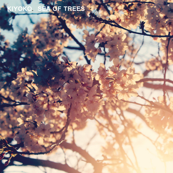
Kiyoko's Sea Of Trees was one of my most listened releases of last summer and it captures the warm summertime feeling flawlessly. The cover plays along the same lines and the mix of warm and cool tones in the photo work nicely in conjunction with the music. The music sounds like the photo, and the photo looks like the music - to me that is beautiful.
04. Letherette - Featurette

Letherette is one of my favourite discoveries from last year - and I have to admit I feel slightly guilty I only discovered their EP's 1 & 2 after a year or two of them being released. Featurette's cover was created by Bibio, and it succeeds in its simplicity. Here's for hoping 2013 will be a big year for Letherette and that their full-length release on Ninja Tune will be quality.
03. Mo Kolours - Banana Wine

What can I say? The cover of Banana Wine is just as colourful and odd as the music it decorates. The curvy and playful shapes create a nice contrast with the geometric typeface choice and grabs your attention instantly!
02. Nujabes - Spiritual State

Nujabes' posthumous album was one of my most eagerly awaited releases of the year (although it was released in Japan in late 2011, the rest of the world got it a few months later in the beginning of 2012). The abstract, colourful illustration on the cover portrays the vivid music of Nujabes perfectly and serves as a face to the album very well. Considering the circumstances, the label could've made the cover dark and sad - but I for sure am glad that the cover of the last Nujabes album shows the colourfulness and hopefulness of his work.
01. Submerse - Tears

This release from Submerse even further showed that Submerse's skills work across a wide variety of genres - his garagey tunes are pure bliss, his release on Apollo showed he can make some nice laid back d'n'b and then Tears showed how well he can handle the more wonky broken beats territory. Tears was packed with textures and little details, and the illustrated cover reflects that beautifully.
_______
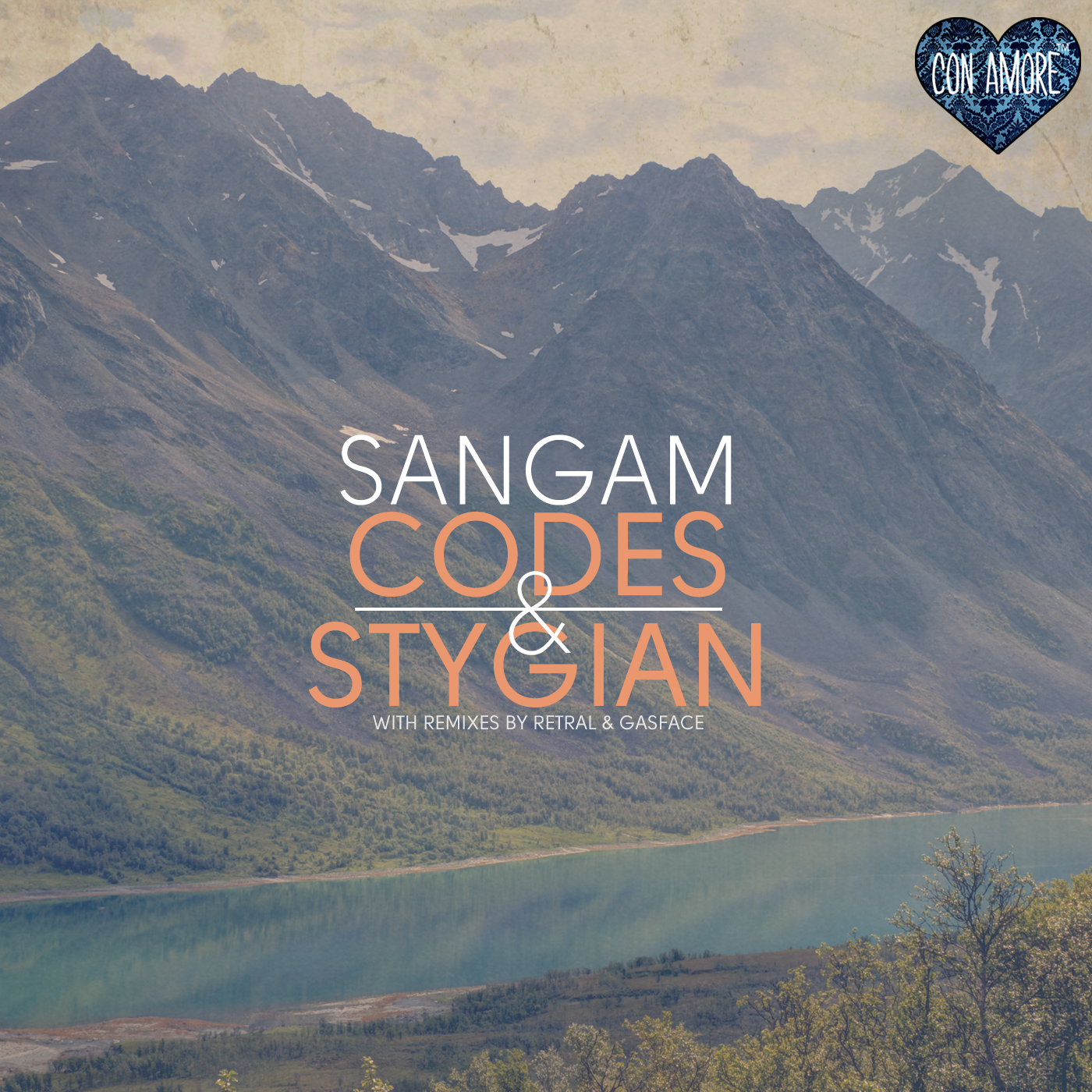
Big up Taavi, thanks for your selection. For what it's worth my favourite artwork was probably this offering from Con Amore Recordings on Sangam's release Codes & Stygian.
_______